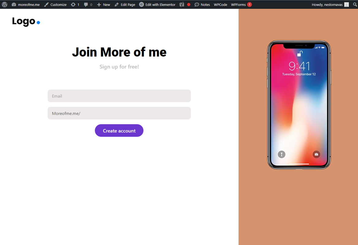
Hi, I would like to make the button wider so that its width is the same as the form fields above it. the elementor editor allows me to increase the text left and right padding so that the buttom gets wider. The problem is that when I do that it causes issues with the button when the screen gets narrower or in mobile phone view. This can be seen in the images below. Is there a way I can fix this with CSS custom code?
I have also copied the custom CSS code that I have to get the form centered.


.formx .elementor-field-type-email.elementor-field-group.elementor-column.elementor-field-group-email.elementor-col-100 {
  display: block;
  margin-left: auto;
  margin-right: auto;
  max-width: 600px !important;
  width:600px !important;
}


.formx .elementor-field-type-text.elementor-field-group.elementor-column.elementor-field-group-username.elementor-col-100 {

  display: block;
  text-align: center;
   margin-left: auto;
  margin-right: auto;
  width: 600px !important;

}


.formx .elementor-field-group.elementor-column.elementor-field-type-submit.elementor-col-100.e-form__buttons {

  display:block;
  text-align: center;


}
/* Readjust the form width for smaller devices */
@media only screen and (max-width: 600px) {

  .formx .elementor-widget-container {
    /* Reset the width for devices under 600px */
        max-width: unset !important;
        width: auto !important;
}
}